Spring 2019
Behind the Cover
Illustrator and designer Annie Riker on how she created the centennial issue cover of National Parks magazine.
I was delighted when Rona Marech, the editor of National Parks, asked me if I’d design the cover of the magazine’s special centennial issue. After working as a graphic designer and creative director at NPCA for seven years, I was very familiar with the organization’s mission, success stories and brand, and creating the anniversary cover sounded like an exciting challenge. I immediately said yes.
The magazine team had already done some initial research on how other businesses and organizations had designed covers marking big anniversaries. They shared some examples they liked and made it clear that whatever direction we ended up going in, it was important to highlight “100 years.”
During my time at NPCA, I thought a lot about the great variety of places the National Park System preserves, including sprawling landscape parks, urban parks, historic and cultural sites, seashores, battlefields, rivers and trails. I clearly remember the biggest challenge in redesigning the organization’s logo was figuring out how to encompass this diversity.
Meanwhile, I’ve been focusing on stickers lately. I love that they are a fun and affordable art form that anyone can enjoy, and I recently made a few stickers showcasing art I’d previously created. The response I got was overwhelmingly positive, so I started making new art in a sticker format. This all led to a compilation piece I designed based on my love of Asheville, North Carolina, where I live now.
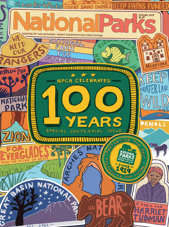
So when I brainstormed about the centennial magazine cover, I started to envision an illustrated page filled with hand-drawn stickers (or patches) that highlight past NPCA campaigns and park sites across the country. The more I thought about this concept, the more it made sense to me for several reasons. To begin with, it highlights NPCA’s work in a fun way. Also, so many park visitors pick up stickers, magnets, buttons, pins or badges, which they stick on water bottles or hang in their offices when they return from trips. I figured representing these sorts of collectibles — and the memories and feelings of nostalgia they evoke — would resonate with readers. And it’s a way of showing the breadth of the parks NPCA has helped protect, which is hard to do with a single image.
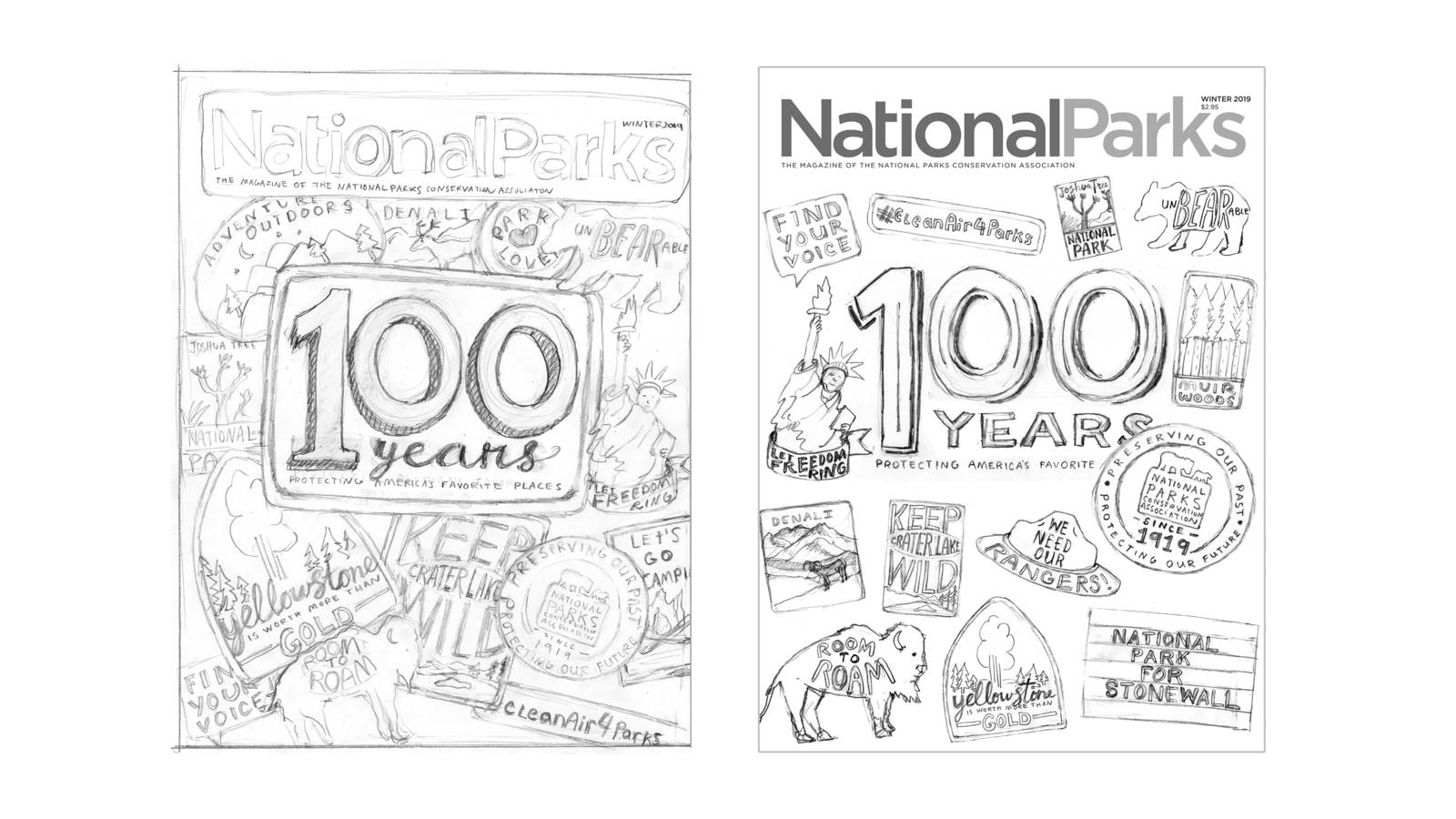
To communicate the idea I had in mind, I started with rough pencil sketches of the patches spread out across the front cover. I also suggested making the issue stand out by extending the illustration onto the back cover instead of running an ad there as usual. The team agreed this was the way to go.
The magazine editors sent me a long list of victories, campaigns, slogans and parks to feature, and I made selections about what to draw with a couple things in mind. I wanted to depict landscapes, people, wildlife, plants and historic or cultural features from a wide range of parks, and it also was important to create a cohesive design.
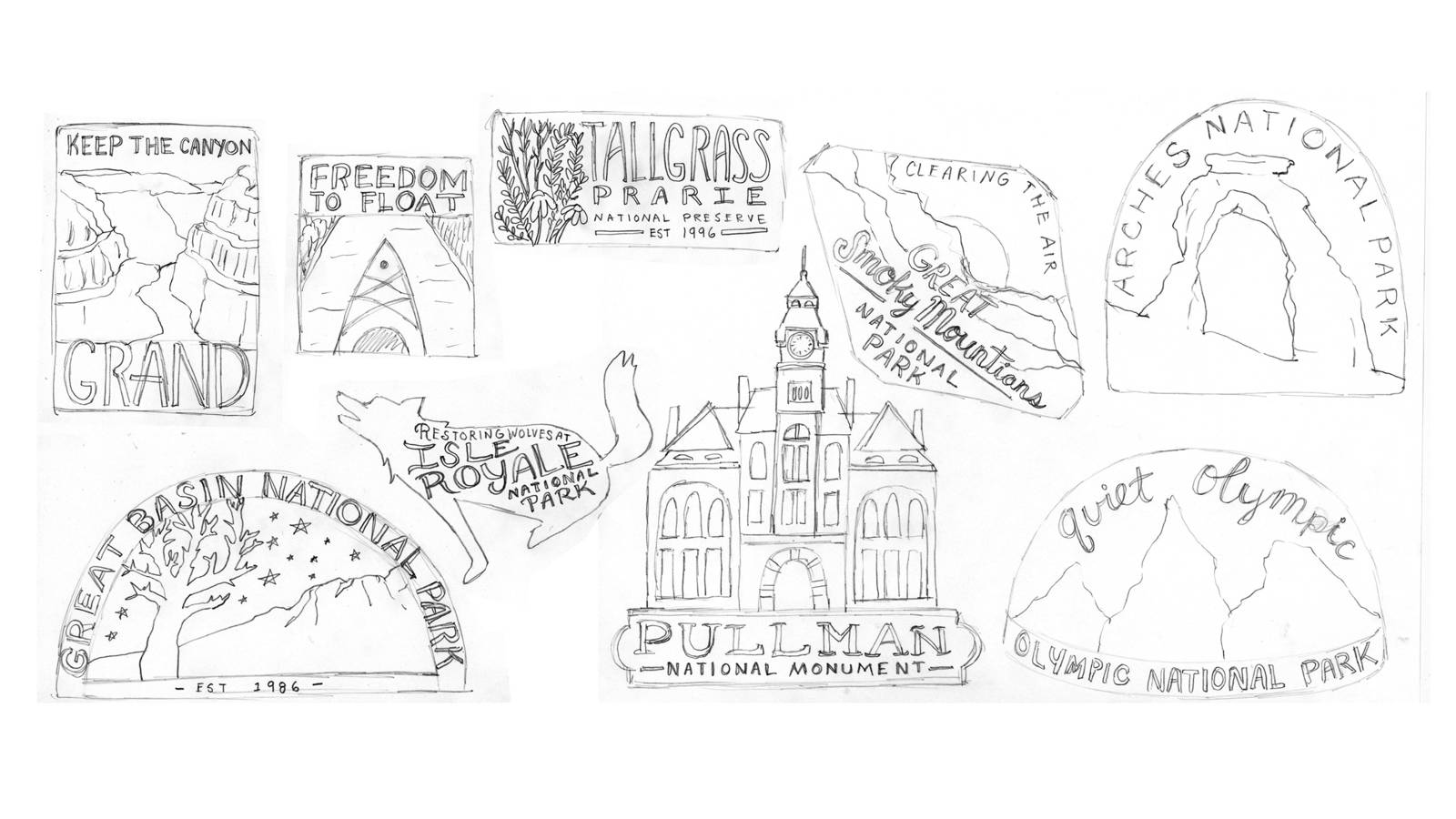
Each patch was individually designed the way I’d design a logo or a sticker. Once I decided on a park, I dove into research in order to uncover the essence of the place. I then came up with some strong visual elements that would capture this, such as a recognizable landscape feature or representative animal. I chose redwood trees, for example, for Muir Woods, and Delicate Arch for Arches National Park.
I began each patch concept with a quick thumbnail sketch, and then I’d choose the strongest design to move forward with, getting approval from NPCA’s team along the way. Next, I started a series of refinement sketches to make the likeness of the person, place or thing more accurate, and to fit the lettering into the space.
When I felt like the sketch was in good shape, my next step was to start inking it with a pen. I then erased any pencil lines, uploaded my inked drawings, and started the next stage of clean-up and fine-tuning in Adobe Photoshop. A lot of artists use tablets, but I use a mouse for the digital part of my process.
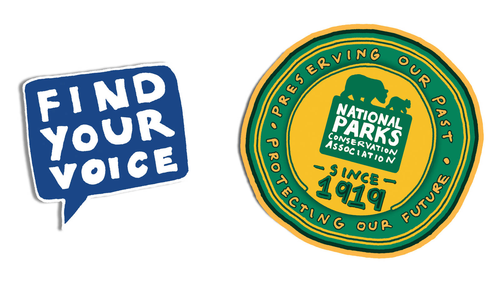
Most of the art I created for the cover is completely original with two exceptions: The official NPCA logo in the seal on the front cover, and the “Find Your Voice” logo on the back cover are based on logos I created for NPCA when I worked there.
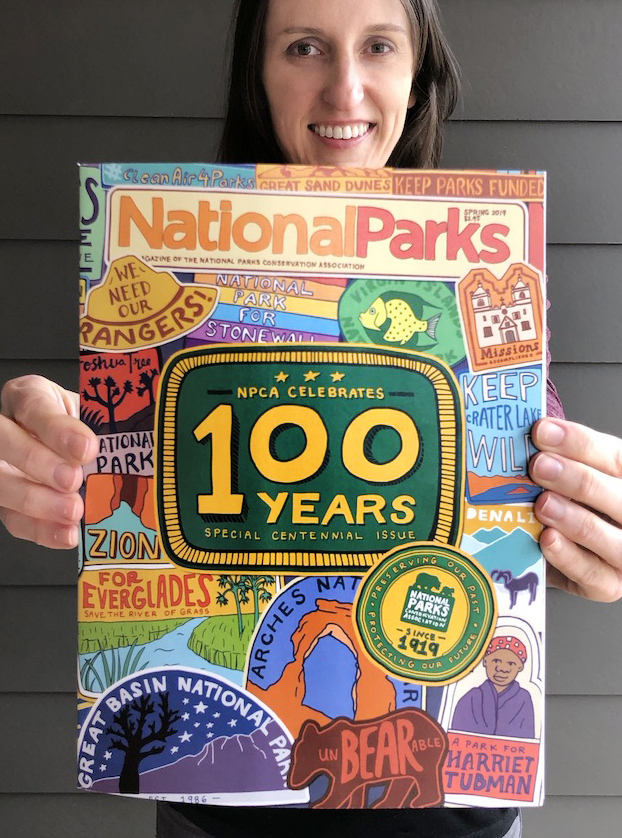
The artist holds the final product.
© ANNIE RIKERIn the end, I created 34 different patches. Once they were complete, I set up a large Photoshop document to the specifications of the magazine and began placing the patches onto the page. I moved them around, rotated them, and scaled them up and down until the balance seemed right. When the general layout looked good to me, I added color. It was a tricky process: I wanted the cover to be bright and colorful, but an overly broad palette easily could make the piece feel disjointed. In addition, figuring out how to make the “100” stand out in a sea of patches proved to be a challenging task. I shared numerous versions with the magazine team (I lost count of how many times we went back and forth) and with their input, continued to adjust the color, placement and size of each patch until the day we sent the files to the printer.
When my copy arrived in early March, I was thrilled to see my artwork again — this time not on my computer, but in the final print form. There is always something so satisfying about holding my finished pieces in my hands. I flipped the magazine over and back, inspecting all the patches and smiling. I really hope the cover makes readers smile, too.
Read the stories behind some of the patches:

About the author
-
 Annie Riker Former Creative Director
Annie Riker is the former Creative Director for NPCA. She’s currently a freelance illustrator and designer based in Asheville, NC.
-
Press Release
Court Reverses Decision on Bears Ears and Grand Staircase-Escalante National Monuments, Sends Back to U.S. District Court in Utah
"These monuments were never meant to be on a political roller coaster. The Antiquities Act is clear: it gives presidents the authority to designate national monuments, but no president has…
-
Press Release
Trump Administration Announces Proposed Rollbacks of Federal Oil and Gas Leasing Reforms, Slashes Opportunities for Public Input
Proposal Raises Concerns Over Impacts on Public Lands, Including National Parks
-
Press Release
Parks Group Seeks Emergency Court Action to Protect Mojave National Preserve
Preliminary Injunction Motion Filed to Prevent Further Damage To National Park


